Step 1, you are going to need some tools:
- Someway to take screenshots and modify the results (I recommend snagit)
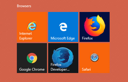
- All the major browsers
- Chrome

- Firefox
- Internet Explorer
- Edge
- Excel (To open the project profile)
- A Photo viewer
- Style Choice: Pixel Perfect extension (If the site has a tall design, this can be helpful)
- Patience
Step 2, make sure you have your resources:
- Has the project profile been updated?
- Is the styleguide/dev-notes somewhere?
- Are all of the comps in the correct folders (adarna/project/graphics/for programmer)?
- Home
- Department
- Interior
- Calendar
- Mobile
- Does the dev site come up?
Step 3, understand the site:
- Read the project profile
- Are there any components that are on/off that will require more/less testing?
- Meetings Manager
- Need to test creation of items/events
- Test box widgets
- Splash Page
- Advanced Mega Menu
- Test Creation of menu
- Test editing of widgets
- Test look front and back
- Test 5+ columns desktop and Mobile
- Do you understand how the Project Manager thinks the homepage will work?
- News?
- Events?
- Buttons?
- Spotlights?
- Header?
- Footer?
- Backgrounds?
- Collage?
- Customizations?
- Look over the comps
- Look at the header/footer
- Is there a collage?
- Backgrounds?
- Number of Events?
- Number of News?
- Spotlights?
- Interiors:
- Link Colors
- Table colors
- More links on box widgets (Do they include the component name?)
- If anything seems weird here
- Comps don’t match what's in the profile
- Functionality doesn’t match what’s in the project profile
- Functionality seems impossible
- Any eh? Moments
- TALK TO THE PROJECT MANAGER
Now to the website:
- First make sure the website is set up correctly
- Are the correct components on?
- If it’s an upgrade, forms and facility directory should especially be checked
- If online payments is enabled, SSL also has to be enabled
- Splash Page is often wrong
- Are the correct system variables on?
- Google Analytics should be set to “Please add key” or to the key in the Project Profile
- Default State is often wrong
- Default Google Maps location is often wrong
- Make sure there are default pages for the list pages
- Add any page templates you will need
- Three column with all the box widgets
- Reverse two column
- Double check the custom content and homepage are setup as they should be based on the project profile.
- THE PROJECT PROFILE IS GOD!
All of these should be done in all major browsers (IE 11, Edge, Firefox, and Chrome currently)
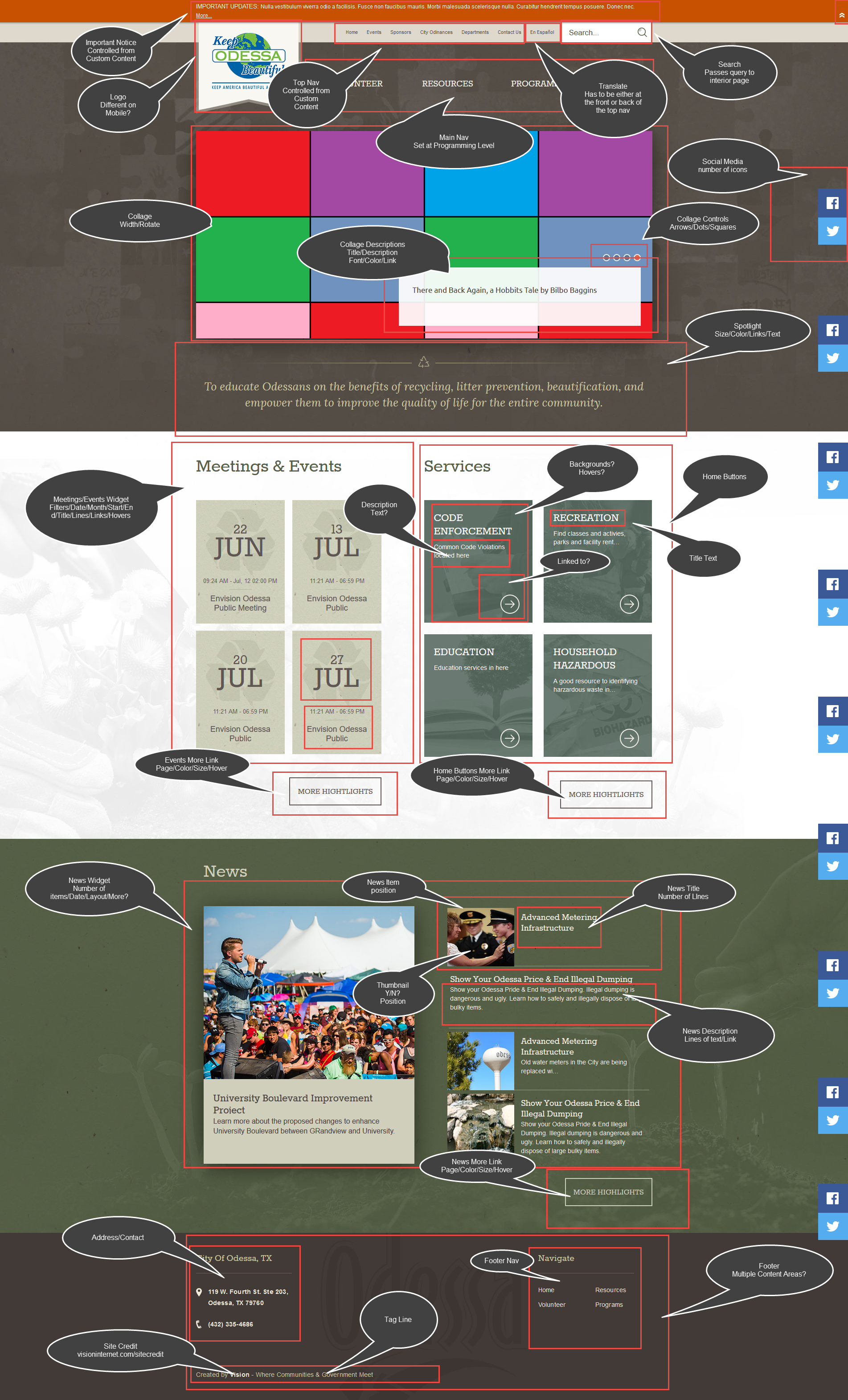
- Homepage Comp Check
- Main Nav
- Labels (Text on top)
- Hovers (Colors, underlines, locations)
- Spacing (Do the gaps match the comps)
- Edging (Do the main navs have any sort of partitions, are they lined up correctly, do the hovers also have them?)
- Source: Make sure Skip Nav matches the display and the comps (WCAG compliance)
- Headers
- Top Nav (Text matches, doesn't overlap, hovers)
- Weather (Intuition and practice, Check a forced negative 3 digit temperature like -108)
- Translate (Has to be first or last in the top nav, won't work on dev sites with the Front-End Protection on)
- Important Notice (Color, display not display, updates)
- Footers
- Spelling (Especially addresses)
- Sitecredit link (Should point to visioninternet.com/sitecredit)
- Social icons (Ordering, colors, hovers, locations)
- Tagline (Use newest)
- Footer navs (colors/hovers)
- Buttons
- normal (Text, editable, icon)
- Hover (Text, editable, icon)
- Should the user be able to control the backgrounds?
- Should the user be able to change the text/icons?
- If responsive:
- Check all sizes (5 breakpoints)
- First large movement of items
- Width just above mobile
- Pay close attention to text in headers and footer
- Watch logo, make sure there is no overlap
- Picture stretching?
- Backgrounds
- How does it move when the screen is resized?
- IN IE: Does the screen stutter when you scroll?
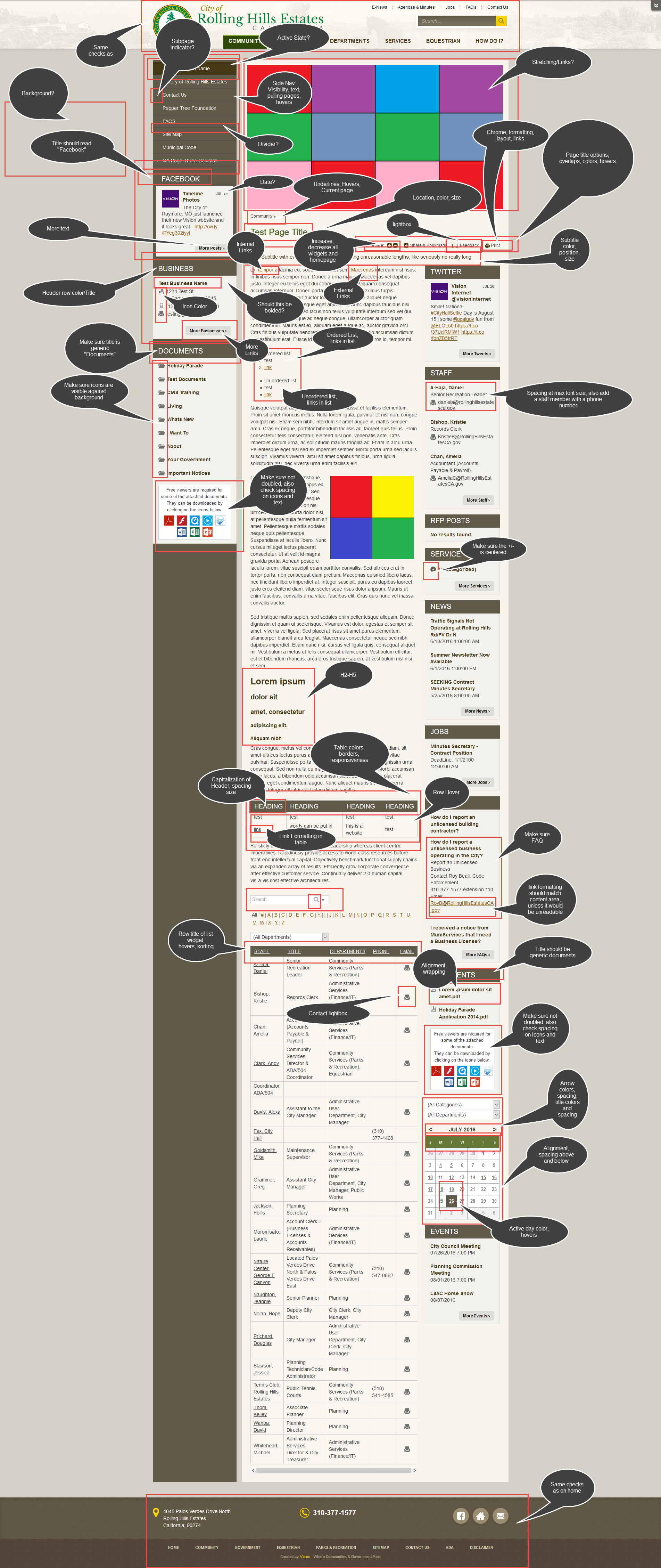
- Interior Pages
- Main Nav
- Labels
- Hovers
- Spacing
- Edging
- Left Nav
- Hovers
- Subpages
- Sub-Subpages
- Subpages above other pages
- Active Page
- Content area
- Links
- Default styles
- Table styles
- Header Row
- Links in Tables
- RAD editor
- Page Title Widget
- all of the sharing options and font resizer
- spacing of the options
- check resizer in all widgets (And Homepage)
- Title and Subtitle
- color
- font
- size
- Spacing between subtitle and page title options
- If responsive
- all of the above checks should be performed and tested on all of the sizes, probably resizing between checks to see the effects
- Special Pages
- 404 page
- Spacing on Submit
- Hover on submit
- Recapcha
- Submit a report
- Check the thank you
- Spacing is often off on the thank you message
- SSO pages (/sys/sso/login)
- Signup for a website user account
- Check formatting of signup
- Check formatting of confirmation page
- Use the confirmation link in the email
- Check the formatting of the confirmation page
- Login
- Check the dashboard links
- Check your profile
- Check the eNotiification signup page (often goes to 404)
- Mobile Specific
- Widget ordering on homepage
- Spelling of the “header” bars on widgets
- What happens to the spotlight
- “Jump to Subpage” Does the client want this or a different text
- Sitemap/Contact us links
- More links on Boxes
- Functionality
- eNotifications
- Check SSO dashboard links
- Navigation


